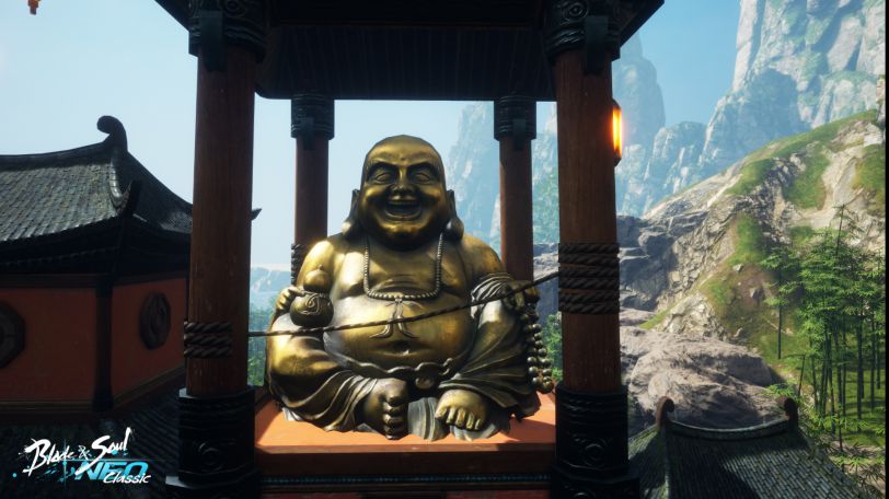
New Blade & Soul NEO Classic Trailer Shows Off Art Differences As The "Soul Log" Continues Reveals
As the "classic" version approaches, we get more info, this time from the art team.

When Blade & Soul migrated to Unreal Engine 4 all those year ago, the upgrade came with some downsides. The MMORPG's team at NCSoft has always felt that while the overall graphics were improved, there were some losses in areas like replicating the specific color palette from UE3.
Today, as the team continues the "Soul Log" reveal of the upcoming NEO Classic version of the title, some of those regrets are being addressed.
Diving into the vegetation and locales in the Viridian Coast zone, a zone MANY of us have visited, the Soul Log provides some neat side by side comparisons of the OG MMO and the new NEO Classic version coming soon.
Color is clearly improved, lighting gets some love, and more detail is added to some familiar places and to some existing assets.
You can check out the comparisons on the site, but there's also a new trailer below that takes you through some of the changes the art team wants to show off.
Related Articles
About the Author

Mike “Magicman” Byrne has been a part of the MMOBomb family for years and serves as the site’s current Editor-in-Chief. His love for MMOs and gaming in general has led him to covering games for numerous gaming websites including Gamebreaker TV and XIV Nation where he proudly displays his fanboy flag for FFXIV:ARR.
More Stories by Michael ByrneRead Next

And the anniversary celebrations will roll into 2025.
You May Enjoy

That’s definitely a different take on the cozy genre.

The updated game features a world “36 times larger than the original Aion.

New gameplay, Creation Engines, and the Scent Weaver Sage hero, are now available.

The global event will culminate at DreamHack Stockholm in November.
Discussion (0)