Starborne Delves Into UI/UX Development And Changes For Next Update
At one point or another, we've all complained about a game's bad user interface. Whether it's the layout of the menus or hotbars, or just where things are arranged, there's probably something you'd like to change about how some of your games are presented. Starborne developer Solid Clouds presented a lengthy blog post today from its "UI/UX guru," Kai, on how its politics UI came into being, and it offers an interesting look into one aspect of video games that we typically take for granted.
Given its nature as a real-time strategy game with little traditional "action," the design of Starborne's UI/UX is even more important that for other games. It starts with a minimalist wireframe that tries to encompass the main features of the interface while also being intuitive and easy to use. Once that's sorted, the art team makes it look like actual in-game menus, creating mock-ups that might alter those original design decisions, especially if parts of it are "too information heavy or simply not looking the way we wanted to."
Once those are sorted out, the panels head off to the production team, along with a bundle of notes. Finally, the UI/UX gets its real workout, going to QA to receive proper testing and feedback, which is incorporated into the final design. Solid Clouds required "several iterations" to get to this approach, but the team expects that more changes to the process will come in the future.
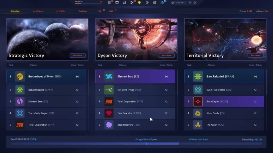
This all segues nicely into the UI changes coming to the Politics panel with the next update, Dissidence, which arrives Oct. 1. The overview screen was "burned to the ground and built from scratch," focusing on the immediacy of current wars and what could be done about them. Alliance screens and even the player profile also received significant reworks.
Also, the ranking system underwent significant changes, including "the quintuplication of ranking categories." That sounds really complex, but it really just means that you'll be better able to find important categories that tell you how awesome you are. This implementation had the effect of "sparking much joy in my heart," Kai said, which makes me all feel warm and fuzzy inside.
Related Articles
About the Author

Jason Winter is a veteran gaming journalist, he brings a wide range of experience to MMOBomb, including two years with Beckett Media where he served as the editor of the leading gaming magazine Massive Online Gamer. He has also written professionally for several gaming websites.
More Stories by Jason WinterRead Next

Game of Thrones: Winter Is Coming has a new update that adds a new system to the game as well as addressing several bugs in the initial launch and adding a few more general improvements.
You May Enjoy

The event will include demos, giveaways, and more.

What answers will you find?

The new League has suffered more than a few hiccups.

It's not surprising, but it's sad.

Discussion (0)